
Most email campaigns die in the inbox.
People see the subject line, maybe open the mail, scroll once and move on. The brands that win on email in 2025 are the ones that treat email not as a digital flyer, but as a small, interactive product.
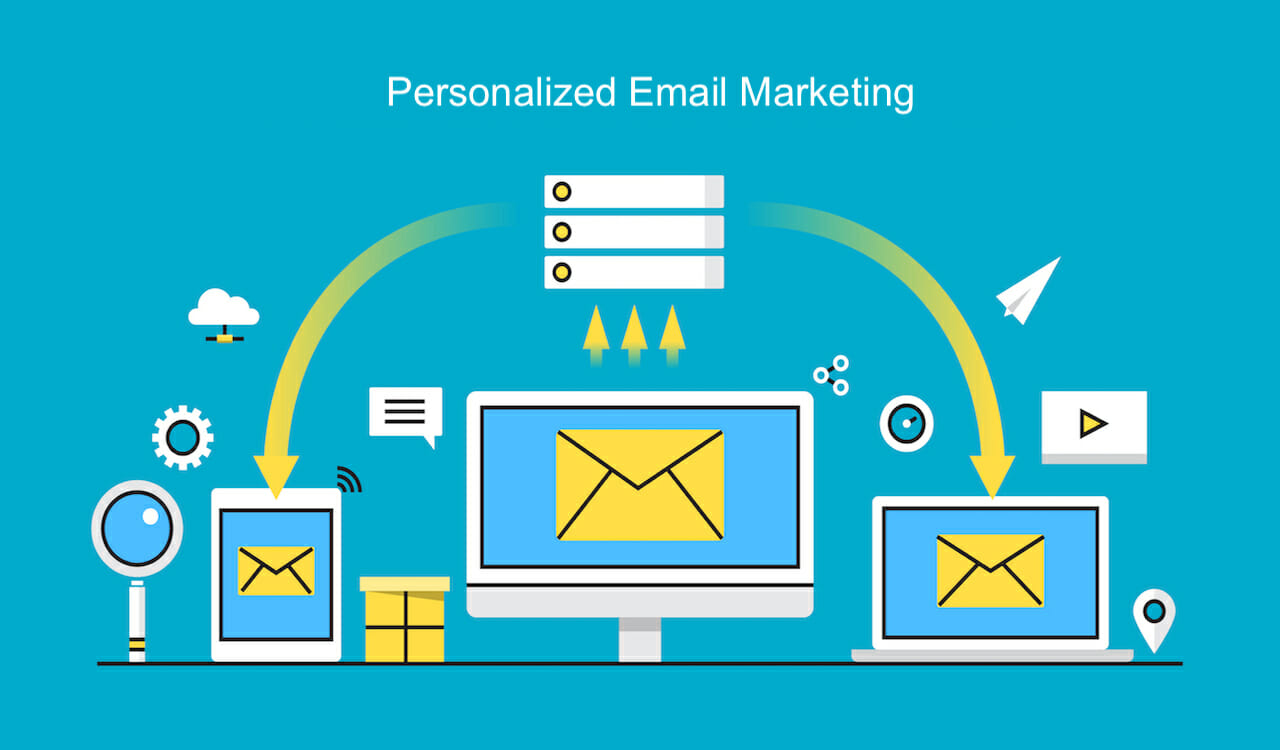
Interactive email campaigns, combined with smart personalization, can dramatically lift your click-through rate (CTR) and overall engagement. Instead of “read this”, the message becomes “do this”. And that single shift in behaviour is where performance jumps.
This guide from Kodo Kompany breaks down how to plan, design and run interactive, personalised email campaigns that actually get clicks, not just opens.
An interactive email is any email where the subscriber can take an action inside the email itself, or the layout clearly invites micro-actions that feel more like a mini experience than a static poster.
Examples of interactive elements:
Image carousels or product sliders
Polls and one-click surveys
Quizzes and “choose your path” blocks
Accordion-style sections that expand or collapse
Scratch cards, progress bars or countdowns
Rating stars and feedback buttons
Button-based journeys like “I am a beginner / intermediate / advanced”
You do not always need heavy tech like AMP to be interactive. Even simple, well-placed buttons and micro-choices can make an email feel more alive.
The key idea: interaction is not decoration. It should move the subscriber closer to taking a meaningful action, like viewing a product, booking a call, or reading your main content.
Personalization alone will get you some lift. Interactivity alone will get you some lift. When you combine both, you give each subscriber a reason to click that feels relevant to them.
Here is why that combination works so well.
More relevance
If the content and call-to-actions change based on user behaviour, role or interest, each email feels less generic and more useful.
Lower effort for the subscriber
One-tap polls, pre-filled buttons and simple choices reduce friction. People are more likely to participate when they do not have to think much.
Built-in curiosity
Interactive elements like quizzes, results, reveal blocks or “see your plan” buttons make people want to see what is behind the click.
Better data for you
Every interaction is a data point: what they clicked, which option they chose, which topic they prefer. You can feed this back into your next campaign.
Stronger feedback loop
When subscribers see that their choices lead to more relevant future content, they become more willing to interact again.
Personalization is not just dropping a first name in the subject line. It starts much earlier.
You can personalize based on:
Behaviour: pages visited, emails opened, clicks, downloads
Purchase or usage: product bought, plan type, tenure, frequency
Role or segment: founder, marketer, developer, decision-maker
Lifecycle stage: new lead, first-time buyer, repeat customer, churn risk
Some simple, high-impact personalization ideas:
Show different hero banners for different segments
Highlight products or services based on last viewed category
Change the main CTA based on lifecycle stage
Use different supporting copy for B2B vs B2C subscribers
Once you know who you are talking to and where they are in the journey, interactivity becomes more focused and less gimmicky.
Let us look at a few patterns you can adapt for your brand.
Context: Someone just joined your list, but you do not know what they care about yet.
Interactive idea:
Add a short “Help us personalise your emails” quiz inside the welcome mail.
Two or three buttons like:
“I want more performance marketing tips”
“I want more content ideas”
“I want more real estate marketing strategies”
Result:
You segment them immediately based on self-declared interest.
Future campaigns feel aligned from email two onwards.
Context: You are sending a newsletter to past buyers or active browsers.
Interactive idea:
Use an image-style carousel layout, each frame representing a product category or collection.
Under each frame, a button like “Explore winter collection”, “See offers in shoes”, “Show me workwear”.
Result:
Instead of a generic “View all products”, you give more specific, relevant choices.
Clicks are more intent-driven, and CTR usually improves when the options are clear and targeted.
Context: You send a monthly digest of blogs, case studies and videos.
Interactive idea:
Turn the email into a mini content hub with sections like:
“For CTOs and Tech Leaders”
“For Marketing and Growth Teams”
“For Founders and CXOs”
Use anchor-like CTAs or bullet-based navigation at the top, so people can jump to the section that matches their role.
Result:
Personalization by self-selection: the subscriber tells you which content they want, based on where they click.
Over time you can adjust future emails to surface more content from the section they prefer.
Context: You are planning features, services or new content.
Interactive idea:
Ask a simple question in the email such as:
“Which topic do you want us to cover next?”
Offer three or four one-click options that act as links or “votes”.
Result:
You capture preference data without sending them to a separate form.
The highest-voted topic becomes your next campaign, and you can follow up with a “You voted, we built this” email.
Here is a simple way Kodo-style teams can plan these campaigns without getting overwhelmed.
Before you think about quizzes or sliders, define the one thing you want the subscriber to do:
Book a call
Browse a collection
Read a case study
Finish onboarding
Once the main action is clear, ask: “What mini-interaction would nudge them toward this action?”
Use your existing data to decide who receives which variation:
New subscribers vs existing customers
High-engagement vs low-engagement segments
Different industries or roles if you are B2B
You do not need ten versions. Even two or three well-thought segments can outperform one generic email.
Most email opens now happen on mobile. Interactivity must respect that:
Make sure buttons are thumb-friendly and spaced out
Avoid cluttered layouts with too many small clickable areas
Test your email on the major mobile email clients you care about
The goal is simple: one glance, one clear action.
Interactive modules should not be surrounded by heavy paragraphs. Use:
Short headlines
One-line explanations
Clear, specific button labels
If the person has to read too much before seeing what to do, you lose the benefit of interactivity.
For each interactive element, define:
What counts as a successful interaction
How you will store that data (tags, custom fields, events)
How it will influence future campaigns or audience segmentation
If you do not have a clear plan for the data, the interaction is only half-valuable.
CTR is important, but interactive, personalized campaigns can improve more than one metric.
Track:
Click-to-open rate (CTOR): Of those who opened, how many clicked?
Time spent reading: Some tools show whether your email was skimmed or read.
Downstream actions: Site engagement after click, add-to-cart, lead form completion, demo requests.
Segment-level performance: Which segments respond best to which type of interaction?
Use these insights to refine:
Which interactive patterns you repeat
Which segments get more advanced experiences
Where you should reduce complexity and keep things simple
Overloading the email with too many interactive blocks
When everything is clickable, nothing feels important. Prioritise one main interactive focus.
Ignoring fallback behaviour
Not all email clients render advanced elements the same way. Make sure there is a simple fallback version for basic clients.
Personalization that feels creepy
Do not over-use behavioural data in a way that feels intrusive. Focus on helpful, context-aware suggestions.
Treating interactivity as decoration
If the interaction does not move the subscriber closer to your core objective, it is likely not worth keeping.
No follow-up based on behaviour
If someone shows clear interest through a quiz or poll, and the next email ignores that, you are wasting a strong signal.
These are the kinds of questions teams often ask when they start planning interactive emails.
Interactive emails increase CTR by turning passive reading into active engagement. When subscribers can vote, choose, explore or reveal content inside the email, they are more likely to click through to complete the journey. Each interaction is a small commitment that makes the final click more natural.
You can start with simple, compatible elements like buttons, polls, image blocks and clear navigation. Advanced features such as AMP emails, in-email forms or complex carousels can come later. The most important part is designing a clear, action-led flow, not chasing every new effect.
Begin with a few clear segments: new vs existing customers, high vs low engagement, or top two industry types you serve. Create one core email and adjust the hero section, main CTA and one interactive block for each segment. This keeps production realistic while still making the experience feel tailored.
Track opens, CTR and CTOR, but also pay attention to which options people select, which sections they click most, and what happens on the website after the click. The best interactive campaigns use this data to refine future content, not just to report click numbers.
A partner agency can help you design the overall strategy, plan segment-based journeys, choose the right email platform, design and build interactive templates, and connect the data back to your CRM or ad funnels. The value is not only in building one campaign, but in creating a repeatable system you can run every month.

April 23, 2024